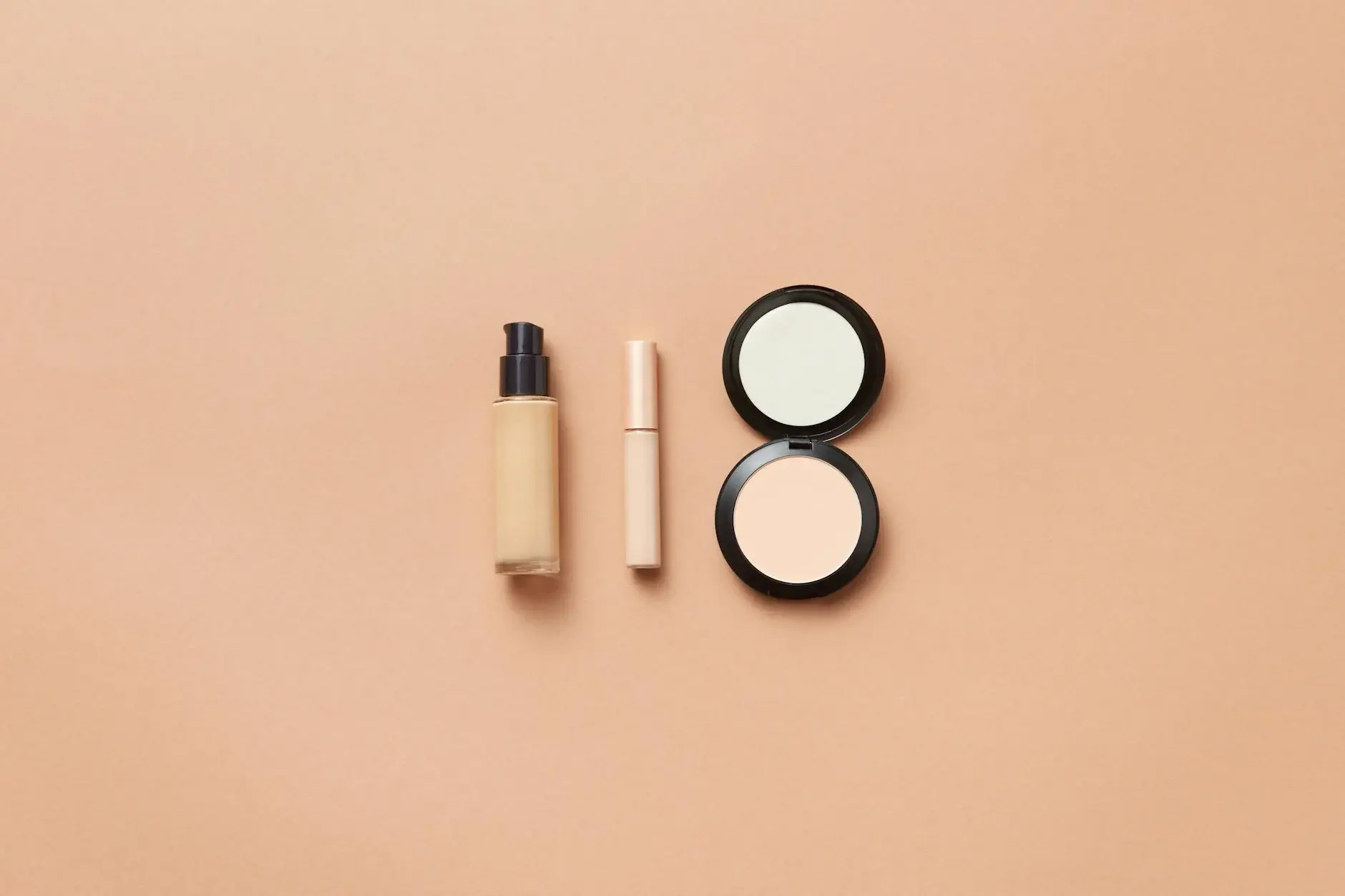
Foundation (warm undertone)
Golden-toned foundation with yellow or golden undertones; avoid anything with pink or cool base.
Why we picked it: Swatch on the jawline in natural light. Warm-leaning neutrals read cleanest.
Shop on AmazonWarm Autumn is the warmest of the Autumn seasons with rich, golden undertones. You look stunning in deep, warm earth tones that complement your natural warmth.
Warm Autumn colors are rich, warm earth tones: burnt orange (#CC5500), terracotta (#CC4E37), olive green (#808000), mustard (#FFDB58), camel (#C19A6B), and rust (#B7410E). Your golden undertones shine in these saturated hues. Skip cool pink, black, and icy colors - they fight your warmth instead of supporting it.
Warm Autumn sits at the golden heart of the color season spectrum. If you have warm undertones in your skin, eyes, and hair, and people often tell you that you look healthiest in earth tones and rich spices, you probably belong here.
The name tells you almost everything. Warm: your coloring has golden or bronze undertones rather than cool pink or neutral ones. Autumn: you share the season's palette of rust, olive, terracotta, and camel. But Warm Autumn is exactly what it sounds like - warmer and more golden than the other Autumn subtypes.
The best way to think about your palette is to picture the colors of late October: amber leaves catching late afternoon sun, the last tomatoes from the garden, cinnamon swirling in hot cider. These are your colors. They live in your skin the way they cannot live in Cool Summer or Clear Winter.
I have seen Warm Autumn clients spend years wearing colors that almost work but never quite sing. They reach for navy and it looks flat. They try gray and it washes them out. They buy black and wonder why they never feel comfortable. Then they put on burnt orange or terracotta and something clicks. That click is your palette calling.
This guide covers your complete Warm Autumn color palette with specific hex codes you can use when shopping, subtype guidance if you are Light Warm or Deep Warm Autumn, a simple test you can do at home to confirm your season, and specific makeup and wardrobe recommendations that go beyond the usual lists.
Warm brown, hazel with golden flecks, amber, or deep green with warmth. Your eyes read as warm rather than cool. In sunlight, you probably notice gold or bronze tones in your iris that others might not see at first glance.
Golden beige, warm olive, peachy tan, or light bronze. Your skin has yellow or golden undertones - this is the most reliable indicator of Warm Autumn. You tan easily and rarely burn. If you have freckles, they likely lean toward orange or copper rather than dark brown.
Auburn, warm chestnut, rich brown with red or golden highlights, copper, or burnished bronze. If your hair has natural warmth - and I mean real warmth, not just brown - you are probably Warm Autumn. Silver or ash tones in hair would indicate a cool season instead.
Medium to medium-high contrast. Your features are not dramatically different from each other - your hair, skin, and eyes all speak the same warm language. This harmony is why you can wear several warm colors in one outfit without looking chaotic.
The gray cloth test is the simplest way to confirm Warm Autumn. Hold a piece of true gray fabric (not silver, not charcoal) against your face in natural daylight. If your skin looks yellow, sallow, or unwell next to gray, you are Warm Autumn. If your skin looks pink or rosy, you might be Cool Summer or Cool Winter instead. Warm Autumn skin reacts to gray by showing its yellow undertone - gray absorbs the warmth and makes golden skin look distinctly off-color.
Most Warm Autumns fall into one of two subtypes. Knowing which one you are helps you fine-tune your palette.
Light Warm Autumn is the lighter variation of Warm Autumn. Your coloring is similar to Warm Autumn but with more lightness and less saturation. You can wear lighter versions of the core Warm Autumn palette: lighter camel instead of dark chocolate, lighter olive instead of deep forest green. Avoid colors that are too heavy or saturated - they will overwhelm your delicate warmth.
Deep Warm Autumn is the darker, more saturated variation of Warm Autumn. Your coloring has more depth than standard Warm Autumn - think rich mahogany instead of auburn, dark chocolate instead of warm brown. You can handle heavier, more intense colors that would overwhelm lighter Warm Autumn types.
Every color season is defined by three dimensions: hue (temperature), value (lightness), and chroma (saturation). Warm Autumn is warm in hue, medium in value, and medium in chroma. This means your best colors are yellow-based, mid-tone, and moderately saturated - not too muted, not too bright.
Warm. Every color in your palette has yellow, gold, or orange in it. This is not optional - your skin literally reflects warm light better than cool light. Cool colors like navy, burgundy, or slate gray will make your skin look sallow or yellow in photos.
Medium. You sit in the middle of the lightness scale. Very light pastels can wash you out because they do not have enough saturation to register against your medium-toned skin. Very dark colors like pure black can overwhelm you. The sweet spot is colors with some weight but not maximum darkness.
Medium saturation. Warm Autumn is not muted like Soft Autumn, but not bright like Warm Spring either. Think of your colors as spices in a jar - concentrated but not fluorescent. Electric colors would fight your natural warmth; gray-muddled colors would disappear on you.
These are your best neutrals for basics and building outfits.
Use these colors for pops of color in accessories or statement pieces.
Best Metal: Gold, rose gold, brass
Each card opens an Amazon search filtered by Warm Autumn tones — terracotta, warm peach, brick red, bronze, copper, warm brown. Rich, warm, earthy shades.
Affiliate disclosure: As an Amazon Associate, DiscoverFashions earns from qualifying purchases. We only feature products we genuinely believe will help our readers.
Golden-toned foundation with yellow or golden undertones; avoid anything with pink or cool base.
Why we picked it: Swatch on the jawline in natural light. Warm-leaning neutrals read cleanest.
Shop on Amazon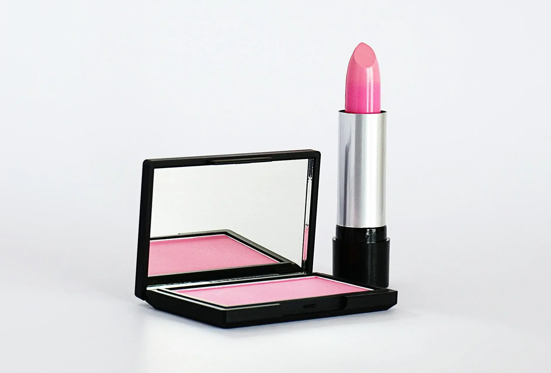
Warm peach or terracotta blush. Apply to the apples of cheeks and blend toward the temples.
Why we picked it: Cream or powder both work; matte finish reads more autumnal than shimmery.
Shop on Amazon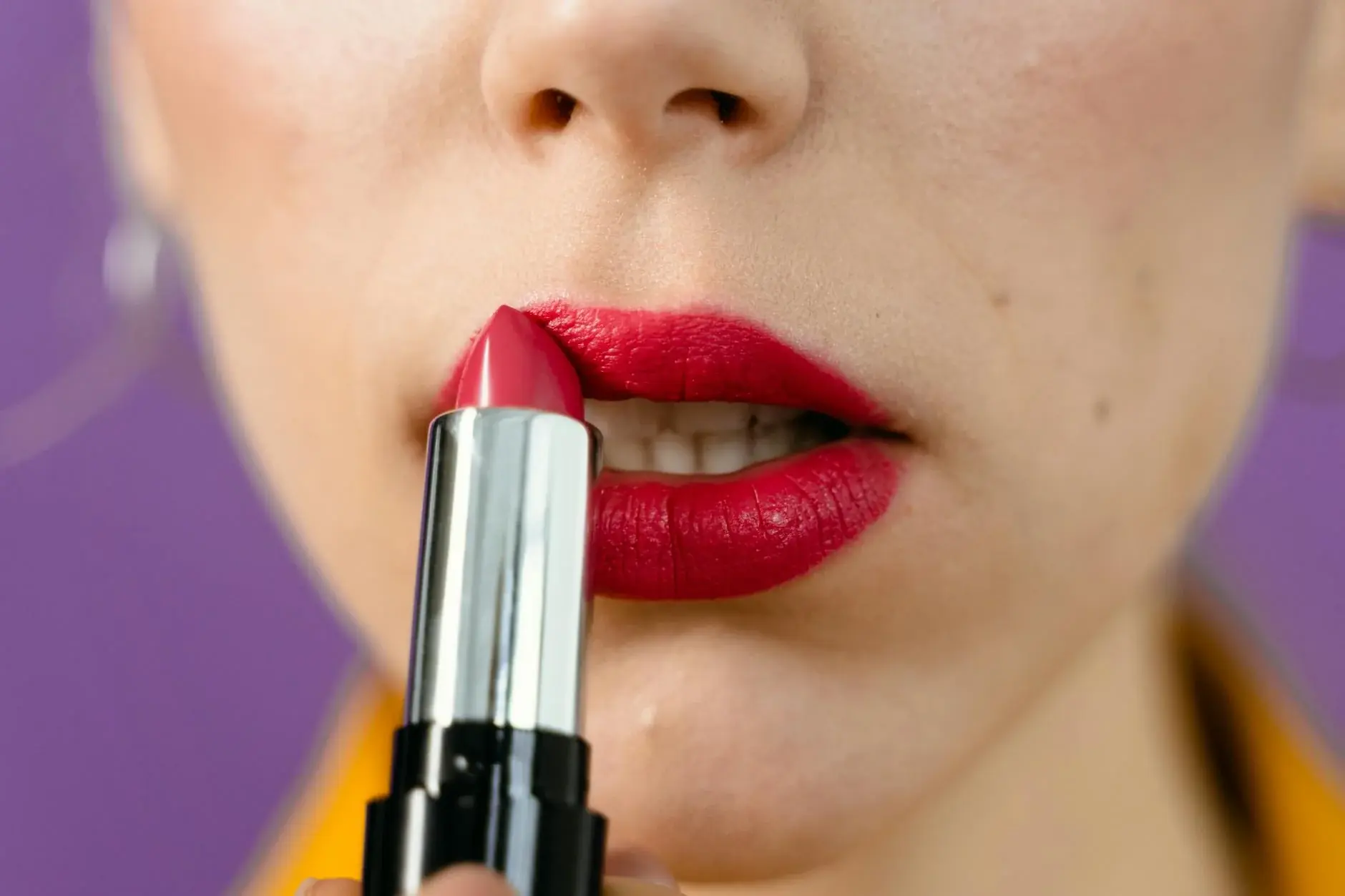
Warm nude, brick red, or terracotta lipstick; look for warm-toned shades labeled brick, terracotta, or warm nude.
Why we picked it: Satin and matte finishes both work; skip cool berry and blue-toned reds.
Shop on Amazon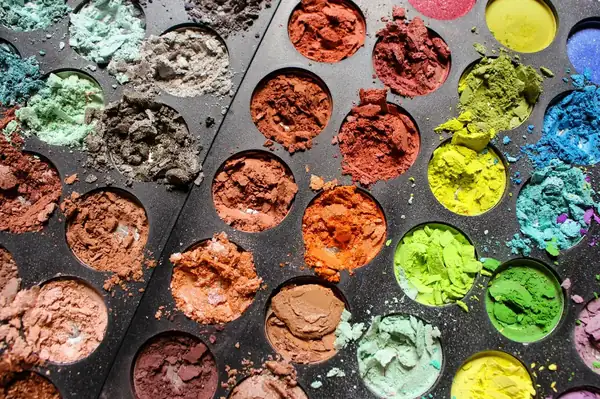
Bronze, copper, and warm brown shadows. Look for a warm bronze or warm copper palette.
Why we picked it: Palettes with warm neutrals + an olive accent give the most range. Skip cool grays and silvers.
Shop on Amazon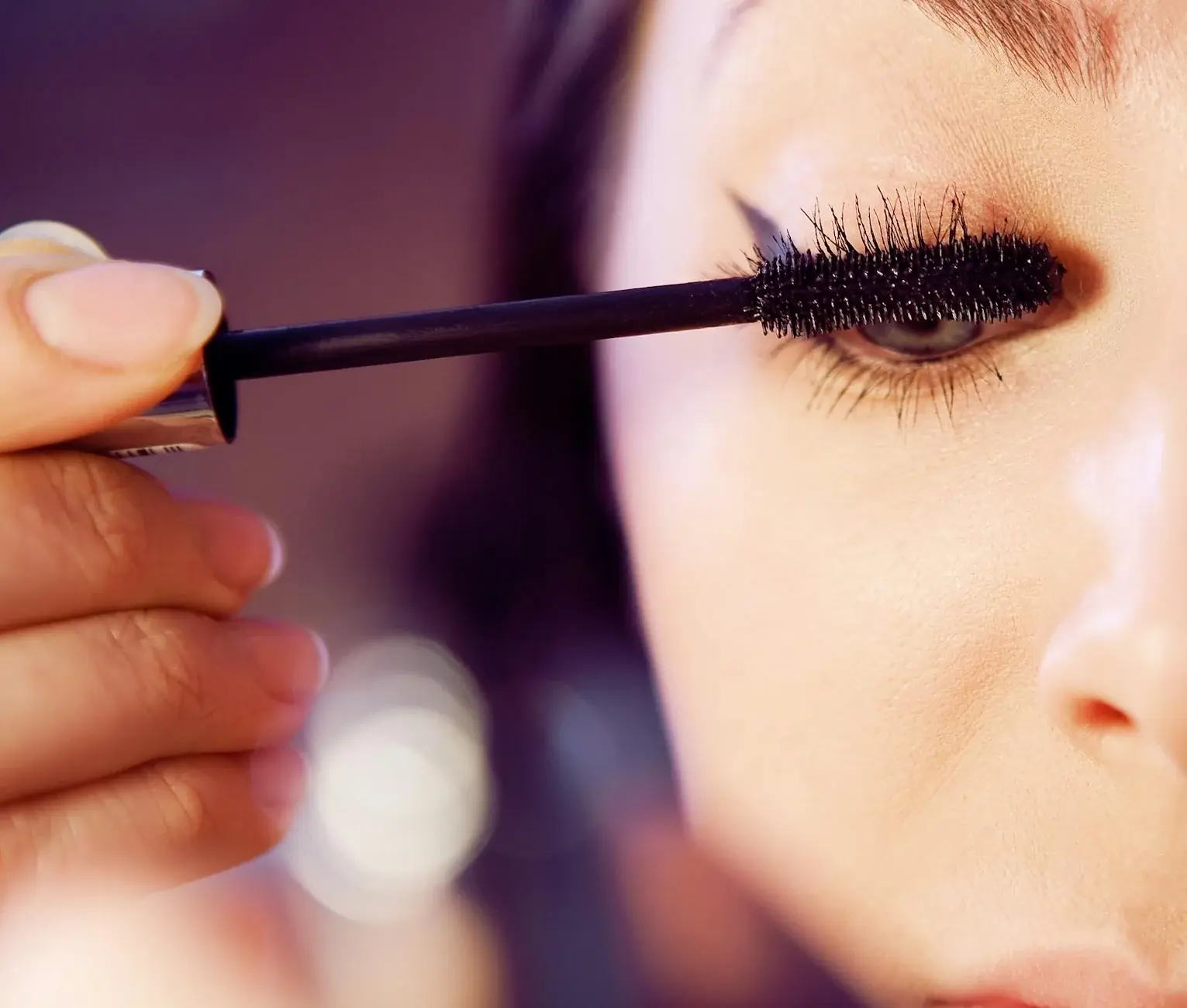
Brown mascara instead of black — it softens rather than starkly framing the warm coloring.
Why we picked it: Warm-toned brown reads more harmonious than cool dark brown.
Shop on AmazonWarm Autumn and Warm Spring both have warm undertones, so telling them apart trips people up. Here is the simplest test: Warm Spring is lighter and brighter, while Warm Autumn is deeper and more muted. A coral that looks fresh on Warm Spring might look heavy on Warm Autumn. An olive that sings on Warm Autumn might look drab on Warm Spring.
Warm Spring has a golden brightness - think fresh apricot, bright coral, warm turquoise. Warm Autumn has a spiced depth - think burnt orange, rich rust, deep olive. If you can wear something right off the rack without wondering if it works, you might be Warm Spring. If you need saturation and weight to feel like yourself, you are probably Warm Autumn.
The biggest clue: Warm Spring can wear lighter neutrals including navy and tan. Warm Autumn needs more earth and spice in neutrals. Think camel and chocolate for Warm Autumn, not tan and navy.
No color palette exists in isolation. You can occasionally borrow from neighboring seasons for more variety.
Deep Autumn shares your warm undertones but has more depth overall. You can borrow their richer versions of your colors - deep rust instead of standard rust, dark chocolate instead of warm brown. Skip their very darkest colors unless you are Deep Warm Autumn subtype.
Warm Spring is lighter and brighter than you are. You can borrow their lighter warm colors for spring and summer - lighter rust, softer coral. Skip anything too bright or clear - it will feel like borrowed brightness rather than natural warmth.
These celebrities are Warm Autumns you can look to for color inspiration:
Antique gold, brass, copper, and warm bronze are your metals. They catch your warmth the way silver would fight it. Rose gold works well too. For finishes, brushed or matte suits Warm Autumn better than high-shine polished - the softer finish matches your palette better.
Carnelian, amber, tiger eye, warm topaz, and coral complement your warmth naturally. Pearls with golden overtones (not stark white) are excellent. Avoid cool stones like amethyst, blue sapphire, or emerald with cool undertones.
Tortoiseshell, warm brown, honey amber, and copper-toned frames look most natural. Avoid cool silver frames or anything with blue or purple in the frame color.
Silk or cashmere in warm prints - rust, olive, mustard, and camel. Paisley and ikat patterns in warm colorways work beautifully. Avoid cool-toned prints or stark white backgrounds.
Weekend outings and outdoor activities
Work and business casual settings
Casual everyday and errands
Date night and evening events
Holiday gatherings and celebrations
Fall outings and apple picking
Pure white is too stark for your warm coloring. Instead, reach for warm ivory (#FFFFF0 with yellow undertones), cream, or ecru. These read as white from a distance but complement your golden undertones up close.
Most pastels lean cool, which works against you. The exceptions are warm pastels: peachy-pink, butter yellow, dusty gold, and soft terracotta. These lighter warm colors can work in spring and summer when deeper warm tones feel too heavy.
Your strongest colors are burnt orange (#CC5500), rust (#B7410E), terracotta (#CC4E37), olive green (#808000), mustard (#FFDB58), camel (#C19A6B), and brick red (#CB4154). These saturated warm hues amplify your natural golden undertones and make you look healthy and vibrant.
For lips: brick red, terracotta, warm nude. For eyes: bronze, copper, warm brown, and olive. For cheeks: warm peach or terracotta blush. Avoid cool pink, berry, and anything with blue base.
Pure black is too harsh for most Warm Autumn types. Instead, use deep chocolate brown (#3D2314), dark olive (#3D4F2F), or warm charcoal. These read as dark from a distance but harmonize with your warmth in a way black never can.
Rich auburn, warm copper, burnished bronze, and golden chestnut are your best matches. Avoid anything with ash, platinum, or cool violet undertones. Warm caramel highlights work well for dimension. Your hair color should catch light with golden or copper tones, not neutral or cool.
Deep Autumn is darker and more saturated than Warm Autumn. If you need very rich, heavy colors to feel balanced, you might be Deep Autumn. If you can wear mid-tone warm colors without feeling overwhelmed, Warm Autumn is likely your season. Deep Autumn also has more contrast between features.
Warm Spring is lighter and brighter than Warm Autumn. Where you wear burnt orange and deep olive, Warm Spring wears bright coral and light lime. Warm Spring can pull off clear, fresh colors that would look heavy on you. You need more saturation and weight.
Soft Autumn sits between Autumn and Summer in the 12-season color analysis system. Your coloring is muted and warm, but gentler than the other Autumn subtypes. Dusty earth tones, warm grays, and low-contrast color combinations are where you look most at home.
Learn MoreDeep Autumn combines warm undertones with depth and richness. Your coloring is dramatic and striking, and it comes alive in saturated, warm hues like olive green, burgundy, and dark teal.
Learn MoreKnowing your palette is step one. Translate it into clothing with a seasonal capsule, or refine the fit using your body shape.
Subscribe for personalized color palettes and styling tips
Free weekly updates. Unsubscribe anytime.