Deep Autumn Color Palette: Colors, Hex Codes, and Outfits
The darkest, richest member of the Autumn family. Warm, deep, jewel-meets-earth colors: espresso, burnt orange, forest green, and burgundy.
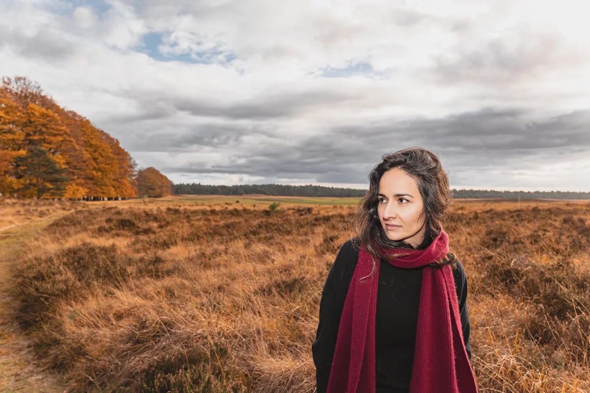
The Deep Autumn color palette is built on warm, deep, medium-to-rich colors like espresso brown, burnt orange, forest green, burgundy, and amber gold. Its dominant trait is depth (a dark value), with a warm golden undertone second. Copper and gold suit it better than silver, and rich, high-contrast outfits look most natural.
If your coloring is warm and deep, and pastels seem to disappear on you, Deep Autumn may be your season. Also called Dark Autumn, it is the darkest and richest branch of the Autumn family, with colors that look like a forest at golden hour: warm, deep, and glowing.
In color analysis, Deep Autumn is defined first by its dark value (depth) and second by its warm undertone. Guides from theconceptwardrobe.com and feelgoodcolors.com describe a palette that is neither as soft as Soft Autumn nor as icy-bright as Winter. The warmth keeps these deep colors looking rich and alive rather than heavy.
This guide gives you the full Deep Autumn palette with 24 hex codes, the colors that tend to overpower your rich coloring, a grey-cloth test to separate Deep Autumn from Deep Winter, celebrity examples drawn from multiple analysts, and a 10-piece capsule wardrobe. The exact hex values are the part most guides skip, and they make this palette simple to shop.
Not sure Deep Autumn is your season? Take our free Color Analysis quiz to confirm your value, undertone, and chroma before you commit to a palette.
What Defines Deep Autumn Coloring
Undertone
Neutral-warm to warm, built on yellow, gold, and bronze. Even cooler colors are chosen in their warmer, more golden-green variants (a warm teal rather than an icy turquoise). Copper, gold, and bronze suit you better than silver.
Not sure which you are? Take the cool vs warm undertone test.
Value (Depth)
Deep and dark. Most of your palette is rich and low in value, though a few medium and lighter tones are included to create the high contrast your coloring can carry.
Chroma (Softness)
Medium-rich. Not as soft as Soft Autumn, and not as icy-bright as Winter. The warmth makes these deep colors look saturated and glowing rather than dull.
Overall Look
High contrast, deep, and warm. Your dark hair and eyes against your skin create natural drama, so rich, saturated colors and bold pairings feel like a natural extension of your coloring.
Deep Autumn Hair, Skin, and Eye Colors
Color seasons describe the natural coloring you already have. These traits often appear together in a Deep Autumn, though any single feature can vary. Draping is always the most reliable check.
Hair
Often medium-dark golden brown, deep chestnut, dark auburn, or warm black, with golden or red highlights that surface in the sun. (Sources: theconceptwardrobe.com, feelgoodcolors.com)
Skin
Usually neutral-warm with a bronze or golden undertone: olive, warm ivory, golden beige, deep bronze, or cocoa. It tends to tan easily, and freckles are common. (Source: feelgoodcolors.com)
Eyes
Frequently dark hazel, dark green, warm dark brown, or warm black, often with the swirled iris pattern typical of the Autumn families. (Source: theconceptwardrobe.com)
The Deep Autumn Color Palette (24 Colors and Hex Codes)
Screenshot this palette and reference it while you shop. Each swatch shows its exact hex code, so you can match colors online or search by code. These are the shades that complement Deep Autumn coloring most naturally.
Colors That Are Harder for Deep Autumn to Wear
None of these are off-limits. They simply pull against Deep Autumn coloring, so they work best away from your face (think shoes, bags, or bottoms). Each one comes with a shade from your own palette that does the same job more comfortably.
Pastel Blue
Too light and cool for a deep, warm season; it can look faded against rich coloring. Deep teal gives you cool depth that still reads warm.
Icy Pink
Its cool, pale quality pulls against your warmth. Ember red and warm plum keep the pink-red family in your range.
Jet Black
Pure black can look hard and cool next to warm coloring; espresso, sable black, and deep olive carry the same depth more comfortably.
Lavender
Cool and light, it fades against deep warm coloring. Warm plum is the richer, warmer alternative.
Cool Fuchsia
Bright and cool, it competes with your warm depth rather than blending with it.
Mint Green
A cool, pale green looks washed against rich coloring; forest green and deep olive are far more complementary.
Neon Colors
Any fluorescent shade clashes with the natural, earthy richness of the palette.
Lemon Yellow
A very light, cool yellow reads thin on warm coloring; amber gold and golden wheat give you yellow with real depth.
How to Confirm You Are a Deep Autumn
Try the grey-cloth test to separate Deep Autumn from Deep Winter, the two seasons most often confused. In daylight, hold a warm rich color like burnt orange or amber gold under your chin, then swap it for an icy cool color like true fuchsia or icy blue. If the warm deep shade makes your skin look glowing while the icy one looks harsh, you are leaning Deep Autumn. Next, compare warm espresso against jet black: Deep Autumns usually look richer in the warm espresso and slightly drained in pure black. Because Deep Autumn borders Warm Autumn (lighter) and Deep Winter (cooler), draping several colors is more reliable than trusting one swatch.
Prefer to skip the fabric test? Our free Color Analysis quiz reads your undertone, value, and chroma from seven quick questions and points you to the right season in about two minutes.
Deep Autumn vs Its Sister Palettes
Most Confused With: Deep Winter
Both seasons are deep and high-contrast, so the palettes both include rich, dramatic colors. Undertone is the deciding factor. Deep Autumn is warm and earthy (espresso, burnt orange, forest green, amber gold), while Deep Winter is cool and jewel-toned (black, sapphire, emerald, icy accents). Copper and gold complement Deep Autumn; silver and platinum complement Deep Winter. Drape a warm burnt orange next to an icy blue to see which one makes your skin glow. Read the full Deep Winter guide.
Warm Autumn
Shares your warm undertone but sits at a medium, more golden depth. Deep Autumn is darker and slightly more saturated. You can borrow some of Warm Autumn's lighter golden tones.
Soft Autumn
Also warm, but much softer, dustier, and lighter. Deep Autumn is the rich, high-contrast end of the same warm family.
Deep Winter
Shares your depth but runs cool and bright rather than warm and earthy. Use its jewel tones carefully, balanced with your warm neutrals.
Deep Autumn Celebrity Examples
These names appear across more than one color analyst as Deep Autumn. Celebrity typing is based on photographs and can differ between analysts, so treat them as a visual reference rather than a rule.
Halle Berry
Appears across multiple analyst lists as a Deep (Dark) Autumn.
Julia Roberts
Frequently analyzed as a Deep Autumn, with warm rich tones suiting her.
Penélope Cruz
Listed by several color analysts as a Deep Autumn with warm depth.
Eva Mendes
Appears on multiple Deep Autumn references for her warm, deep coloring.
Angela Bassett
Named as a Deep Autumn across more than one analyst.
Freida Pinto
Listed as a Deep Autumn in multiple color analysis references.
Deep Autumn Color Combinations
Five outfit-ready combinations built entirely from your palette. Each one balances neutrals and accents in a way that suits Deep Autumn coloring.
Camel Rust Olive
Camel, copper rust, and deep olive for a natural, high-contrast autumn outfit.
Espresso and Amber
Espresso grounded with amber gold and a hit of deep teal for depth with warmth.
Burgundy Forest
Deep burgundy, forest green, and warm oat for a rich, cozy pairing.
Burnt Orange Anchor
Burnt orange with camel and warm taupe, a warm outfit with a glowing accent.
Chocolate and Copper
Dark chocolate, copper rust, and moss olive for an earthy, layered look.
Metals and Accessories for Deep Autumn
Best Metals
Copper, yellow gold, bronze, and brass are your best metals, especially in antique, oxidized, or hammered finishes. Silver can work if it is not too cold and bright. The warmth of your metals should echo the warmth of your palette.
Stones and Accessories
Warm stones suit you: carnelian, garnet, jasper, amber, tiger's eye, and smoky quartz, plus emerald in a warm gold setting. Textured, matte, or antiqued pieces echo the rich, earthy character of the palette.
A 10-Piece Deep Autumn Capsule Wardrobe
Ten versatile pieces in your best colors that mix and match into dozens of outfits. Pair this with our Capsule Wardrobe Quiz to match the pieces to your personal style too.
Structured blazer
Deep Olive #404C24
Trench coat
Camel #C19A6B
Tailored trousers
Dark Chocolate #3D2914
Jeans
Olive Brown #675742
Oversize sweater
Copper Rust #B86537
Button-down shirt
Warm Oat #E3C9A8
Midi dress
Deep Burgundy #4B2E39
Pencil skirt
Deep Teal #0F4C5C
Knit cardigan
Warm Taupe #8C7262
Leather jacket
Walnut Brown #4E3A2D
Deep Autumn Color Palette FAQ
What is the Deep Autumn color palette?
The Deep Autumn (Dark Autumn) color palette is a set of warm, deep, medium-to-rich colors: espresso brown, burnt orange, copper rust, forest green, deep olive, deep burgundy, amber gold, and warm plum among them. The colors are dark and saturated with golden warmth underneath, which suits Deep Autumn coloring far better than pale or icy shades.
What is the difference between Deep Autumn and Deep Winter?
Undertone is the deciding factor. Deep Autumn is warm and earthy (espresso, burnt orange, forest green), while Deep Winter is cool and jewel-toned (black, sapphire, emerald, icy accents). Both are deep and high-contrast, but Deep Autumn complements copper and gold, and Deep Winter complements silver and platinum.
Is Deep Autumn the same as Dark Autumn?
Yes. Deep Autumn and Dark Autumn are two names for the same sub-season, the darkest and richest branch of the Autumn family. Different color systems and analysts favor one label over the other, but the palette (warm, deep, medium-rich colors) is the same either way.
Can Deep Autumns wear black?
Pure jet black can look hard and slightly cool against warm Deep Autumn coloring. Warmer, deep alternatives usually look richer: reach for espresso brown, sable black, or deep olive. If you want a true black moment, keep it away from your face and pair it with a warm color near your neckline.
What colors should Deep Autumns avoid?
The trickiest colors are pale, cool, or icy: pastel blue, icy pink, lavender, mint green, lemon yellow, and cool fuchsia, along with any neon. These either fade against rich coloring or pull against the warm undertone. Deep, warm versions of the same hues (like deep teal or warm plum) are much easier to wear.
What celebrities are Deep Autumn?
Names that appear across multiple color analysts include Halle Berry, Julia Roberts, Penélope Cruz, Eva Mendes, Angela Bassett, and Freida Pinto. Celebrity typing is based on photographs and can vary between analysts, so professional draping remains the most reliable method.
How do I know if I am a Deep Autumn?
Look for deep, warm coloring: dark golden-brown or auburn hair, warm dark eyes, and skin with a golden or bronze undertone, with high contrast between features. Then try the grey-cloth test: if burnt orange or amber makes your skin glow while icy colors look harsh, you are likely Deep Autumn. Our free Color Analysis quiz can confirm it.
What neutrals work best for Deep Autumn?
Your strongest neutrals are deep and warm: espresso brown, dark chocolate, walnut, camel, warm taupe, and warm oat. These anchor your richer accents and hold up the high-contrast pairings that suit Deep Autumn coloring, from camel-and-rust to chocolate-and-copper.
Can Deep Autumns wear jewel tones?
Yes, as long as they lean warm. Deep teal, forest green, ember red, and warm plum give you the jewel-tone drama your depth can carry, without the icy edge of true Winter jewels. Pair them with warm neutrals like camel or espresso to keep the whole outfit in your palette.
Explore Other Color Seasons
Soft Summer
The most muted, cool-leaning member of the Summer family. Think misty, blended, gently greyed-down colors that look effortless together.
Soft Autumn
The gentlest, warmest member of the Autumn family. Watercolor-soft earth tones: camel, dusty rose, soft teal, and warm taupe that melt together.
Deep Winter
The darkest, most dramatic member of the Winter family. Cool, deep, high-contrast jewel tones: black, sapphire, emerald, ruby, and icy accents.
Warm Spring
The warmest, brightest member of the Spring family. Golden-hour colors: coral, warm turquoise, tomato red, and golden yellow that glow rather than shout.
Warm Autumn
The golden heart of the Autumn family. Spiced, earthy colors with real depth: burnt orange, rust, olive green, and mustard that feel like late October light.
Cool Winter
The most purely cool member of the Winter family. Pure, blue-based colors: true red, magenta, royal blue, and icy pink with clarity but not maximum brightness.
Clear Winter
The brightest, highest-contrast member of the Winter family. Vivid, cool colors: electric blue, fuchsia, emerald, and true red at maximum clarity.
Light Spring
The lightest, most delicate member of the Spring family. Fresh warm pastels: peach blossom, butter yellow, soft coral, and powder blue that feel like the first week of spring.
Clear Spring
The brightest, most vibrant member of the Spring family. Electric warm colors: clear coral, golden yellow, bright emerald, and clear aqua at full saturation.
Light Summer
The lightest, airiest member of the Summer family. Cool, misty pastels: powder blue, pale rose, pale lavender, and soft sage that feel like a soft morning sky.
Cool Summer
The archetypal, most purely cool member of the Summer family. Refined blue-based colors: soft navy, dusty rose, dusty teal, and soft plum with a calm, dusky quality.