Warm Autumn Color Palette: Colors, Hex Codes, and Outfits
The golden heart of the Autumn family. Spiced, earthy colors with real depth: burnt orange, rust, olive green, and mustard that feel like late October light.
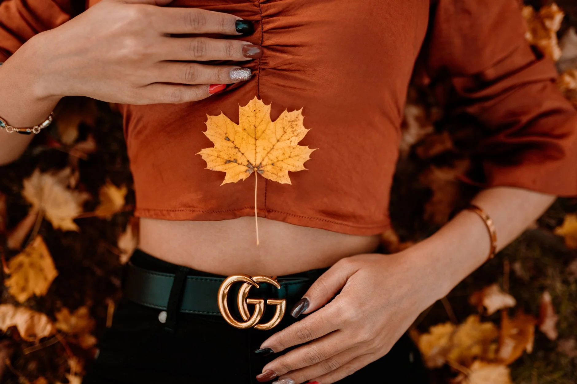
The Warm Autumn color palette is built on warm, medium-chroma earth tones like burnt orange, rust, terracotta, olive green, mustard, and camel. Its dominant trait is warmth (a golden-to-bronze undertone), with medium depth second. Gold suits it better than silver, and rich, earthy outfits look most natural.
Wondering whether you are a Warm Autumn, and what that actually means for your wardrobe? You are in the right place. Warm Autumn sits at the golden heart of the Autumn family. If you have warm undertones in your skin, eyes, and hair, and people often tell you that you look healthiest in earth tones and rich spices, you probably belong here.
In the 12-season color analysis system, every season is defined by three qualities: undertone (warm or cool), value (light or deep), and chroma (bright or muted). Warm Autumn is warm in hue, medium in value, and medium in chroma. Your best colors are yellow-based, mid-tone, and moderately saturated, not muted like Soft Autumn and not as bright as Warm Spring.
Picture the colors of late October: amber leaves catching afternoon sun, the last tomatoes from the garden, cinnamon swirling in hot cider. That is your palette. This guide gives you the full Warm Autumn palette with 16 hex codes you can screenshot and shop from, the shades that tend to wash out your warmth, a grey-cloth test to confirm your season, celebrity examples, and a 10-piece capsule wardrobe.
Not sure Warm Autumn is your season? Take our free Color Analysis quiz to confirm your undertone, value, and chroma in about two minutes before you commit to a palette.
What Defines Warm Autumn Coloring
Undertone
Warm, built on golden or bronze tones rather than cool pink or neutral ones. Gold, antique brass, and copper generally suit you better than silver.
Not sure which you are? Take the cool vs warm undertone test.
Value (Depth)
Medium. You sit in the middle of the lightness scale, so very light pastels can wash you out while very dark colors like pure black can overwhelm you. The sweet spot has some weight but not maximum darkness.
Chroma (Softness)
Medium. Warm Autumn is not muted like Soft Autumn, but not bright like Warm Spring either. Think of your colors as spices in a jar: concentrated but not fluorescent.
Overall Look
Medium to medium-high contrast, warm, and earthy. Your hair, skin, and eyes speak the same warm language, which is why several warm colors worn together read as harmonious rather than chaotic.
Warm Autumn Hair, Skin, and Eye Colors
Color seasons describe the natural coloring you already have. These traits often appear together in a Warm Autumn, though any single feature can vary. Draping is always the most reliable check.
Hair
Often auburn, warm chestnut, rich brown with red or golden highlights, copper, or burnished bronze, with real warmth rather than a neutral brown. Silver or ash tones in hair point to a cool season instead.
Skin
Usually golden beige, warm olive, peachy tan, or light bronze with a reliably yellow or golden undertone. Warm Autumn skin tans easily and rarely burns; freckles, when present, tend to lean orange or copper.
Eyes
Frequently warm brown, hazel with golden flecks, amber, or deep green with warmth. In sunlight, gold or bronze tones often become visible in the iris that are not obvious at first glance.
The Warm Autumn Color Palette (16 Colors and Hex Codes)
Screenshot this palette and reference it while you shop. Each swatch shows its exact hex code, so you can match colors online or search by code. These are the shades that complement Warm Autumn coloring most naturally.
Colors That Are Harder for Warm Autumn to Wear
None of these are off-limits. They simply pull against Warm Autumn coloring, so they work best away from your face (think shoes, bags, or bottoms). Each one comes with a shade from your own palette that does the same job more comfortably.
Cool Pink
A cool, icy pink pulls against your golden undertone and can make skin look sallow. Terracotta or brick red carry warmth in a similar family.
Blue-Red
Cool and blue-based, it clashes with your warm undertone. Brick red or rust give you the same intensity with warmth built in.
Black
Pure black is too hard and cool against warm coloring; warm brown or deep olive carry the same depth more comfortably.
Pure White
Too crisp and cool for a warm, medium season. Cream or warm ivory give you lightness without the sharp edge.
Icy Colors
Icy, pale, cool shades lack the warmth and depth your coloring needs, so they tend to wash you out.
Gray
A neutral cool gray reads flat on warm skin. Warm taupe or bronze give you a similar neutral role with more life.
Cool Purple
Blue-based purples fight your golden undertone. Warm plum or brick red keep the same depth in a warmer key.
Fuchsia
Bright and cool-leaning, it overwhelms your medium, earthy coloring. Rust or terracotta are the warmer, more grounded alternatives.
How to Confirm You Are a Warm Autumn
Try the grey-cloth test with a warm twist. In natural daylight, hold a warm, medium color like rust or camel under your chin, then swap it for a cool, icy color like icy pink or true blue. If the warm shade looks healthy and alive while the cool one looks flat or sallow, you are leaning Warm Autumn. Next, compare warm camel against cool gray: Warm Autumns usually look richer in the camel. Because Warm Autumn borders Warm Spring (lighter, brighter) and Deep Autumn (darker, more saturated), draping several colors is more reliable than trusting one swatch.
Prefer to skip the fabric test? Our free Color Analysis quiz reads your undertone, value, and chroma from seven quick questions and points you to the right season in about two minutes.
Warm Autumn vs Its Sister Palettes
Most Confused With: Deep Autumn
Both seasons share a warm, earthy undertone, so the palettes overlap at a glance. The deciding factor is depth. Warm Autumn sits at a medium value with medium saturation (burnt orange, mustard, camel), while Deep Autumn is darker and more saturated (espresso, deep olive, amber gold). If you need very rich, heavy colors to feel balanced, you likely lean Deep Autumn. If mid-tone warm colors already feel like plenty, Warm Autumn is more likely your season. Read the full Deep Autumn guide.
Deep Autumn
Shares your warm undertone but has more overall depth. You can borrow their richer versions of your colors, like deep rust instead of standard rust, but their darkest shades usually belong to a deeper subtype.
Warm Spring
Lighter and brighter than you are. You can borrow their lighter warm colors for spring and summer, like softer rust or lighter coral, but their clearest, brightest shades will feel like borrowed brightness rather than natural warmth.
Soft Autumn
Also warm, but much softer and dustier. Warm Autumn carries more saturation and depth than the gentle, blended quality that defines Soft Autumn.
Warm Autumn Celebrity Examples
These names appear across more than one color analyst as Warm Autumn. Celebrity typing is based on photographs and can differ between analysts, so treat them as a visual reference rather than a rule.
Julia Roberts
Warm reddish-brown hair and golden, warm skin are consistent with the medium-depth, earthy coloring that defines Warm Autumn.
Julianne Moore
Warm red hair and fair, warm skin place her in the warm color families, where rust and warm brown tones read especially well.
Jennifer Lopez
Warm golden-brown hair and warm, bronze-toned skin reflect the medium warmth typical of Warm Autumn.
Catherine Zeta-Jones
Rich, warm dark brown hair paired with warm olive skin fits the earthy, medium-depth quality of this season.
Kate Winslet
Warm reddish-blonde hair and fair, warm skin align with the golden, medium-toned coloring of Warm Autumn.
Florence Welch
Naturally warm red hair and fair, warm skin are a textbook match for the golden warmth of this season.
Warm Autumn Color Combinations
Five outfit-ready combinations built entirely from your palette. Each one balances neutrals and accents in a way that suits Warm Autumn coloring.
Autumn Forest
Olive green, rust, and camel for a natural, grounded outfit that feels like a walk through fall leaves.
Harvest Gold
Mustard, warm brown, and burnt orange layered for a rich, cozy combination.
Spice Market
Burnt orange and mustard balanced with forest green for a warm, spiced outfit.
Fireside Glow
Brick red and deep teal grounded with camel for an evening-ready pairing.
Golden Hour
Camel, rust, and deep teal for an easy, warm, everyday combination.
Fall 2026 Trend Direction
Camel has emerged as fall 2026's defining neutral in trend reports, and it happens to be one of Warm Autumn's core colors, alongside warm taupe and walnut brown. A camel coat, skirt, or wide-leg trouser needs nothing added to work with your coloring; it already sits in your palette. Camel also pairs naturally with this season's structured tailoring and statement-outerwear trends. If you have a pear body shape, a camel A-line skirt paired with a more structured top keeps the visual balance moving upward.
See more ways to work with that silhouette in our Pear body shape guide.
Metals and Accessories for Warm Autumn
Best Metals
Antique gold, brass, copper, and warm bronze are your best metals, catching your warmth the way silver would fight it. Rose gold also works well. Brushed or matte finishes suit Warm Autumn better than high-shine polished, matching the softer character of your palette.
Stones and Accessories
Carnelian, amber, tiger eye, warm topaz, and coral complement your warmth naturally. Pearls with golden overtones work better than stark white ones. Cool stones like amethyst, blue sapphire, or cool-toned emerald tend to fight your warmth.
A 10-Piece Warm Autumn Capsule Wardrobe
Ten versatile pieces in your best colors that mix and match into dozens of outfits. Pair this with our Capsule Wardrobe Quiz to match the pieces to your personal style too.
Cashmere sweater
Burnt Orange #CC5500
Wool trousers
Camel #C19A6B
Silk blouse
Olive Green #808000
Cotton tee
Mustard #FFDB58
Wrap dress
Rust #B7410E
Field coat
Forest Green #228B22
Leather blazer
Warm Brown #A52A2A
Midi dress
Deep Teal #006D77
Suede jacket
Bronze #CD7F32
Statement scarf
Terracotta #CC4E37
Warm Autumn Color Palette FAQ
What is the Warm Autumn color palette?
The Warm Autumn color palette is a set of warm, medium-chroma earth tones: burnt orange, rust, terracotta, olive green, mustard, camel, bronze, and brick red among them. Every color carries golden or bronze warmth, which suits Warm Autumn coloring better than muted or cool shades.
What is the difference between Warm Autumn and Deep Autumn?
Depth is the deciding factor. Warm Autumn sits at a medium value with medium saturation, while Deep Autumn is darker and more saturated. Both share the same warm, earthy undertone, but Deep Autumn needs heavier, richer colors to feel balanced, while Warm Autumn looks best in mid-tone warmth.
Can Warm Autumns wear black and white?
Pure black and pure white tend to be too hard and cool for warm, medium coloring. Warmer alternatives look more harmonious: reach for warm brown or deep olive instead of black, and cream or warm ivory instead of stark white.
Is gold or silver better for Warm Autumn?
Antique gold, brass, copper, and warm bronze are the most complementary metals for Warm Autumn. Rose gold also works well. Bright silver and cool metals usually feel too cold against warm coloring.
What colors should Warm Autumns avoid?
The trickiest colors are cool, icy, or very dark: cool pink, blue-red, black, pure white, icy colors, gray, cool purple, and fuchsia. These pull against the warm undertone or overwhelm the medium-depth coloring. Warm, earthy versions of the same hues are much easier to wear.
What celebrities are Warm Autumn?
Names commonly associated with Warm Autumn coloring include Julia Roberts, Julianne Moore, Jennifer Lopez, Catherine Zeta-Jones, Kate Winslet, and Florence Welch, all of whom share warm, medium-depth hair and skin tones. Celebrity typing is based on photographs and can vary between analysts, so professional draping remains the most reliable method.
How do I know if I am a Warm Autumn?
Look for a warm, golden or bronze undertone in your skin, auburn or warm brown hair, and medium-to-high contrast between your features. Then try the grey-cloth test: if a warm rust or camel makes you look healthier than a neutral gray does, you are likely Warm Autumn. Our free Color Analysis quiz can confirm it.
What neutrals work best for Warm Autumn?
Your strongest neutrals are warm and medium-toned: camel, warm brown, bronze, olive, and cream. These pair with nearly every accent color in your palette and hold up the earthy, high-contrast pairings that suit Warm Autumn coloring.
Can Warm Autumns wear jewel tones?
Yes, as long as they lean warm. Deep teal and forest green give you jewel-tone richness without the icy edge of true Winter jewels. Pair them with warm neutrals like camel or warm brown to keep the whole outfit in your palette.
Explore Other Color Seasons
Soft Summer
The most muted, cool-leaning member of the Summer family. Think misty, blended, gently greyed-down colors that look effortless together.
Soft Autumn
The gentlest, warmest member of the Autumn family. Watercolor-soft earth tones: camel, dusty rose, soft teal, and warm taupe that melt together.
Deep Autumn
The darkest, richest member of the Autumn family. Warm, deep, jewel-meets-earth colors: espresso, burnt orange, forest green, and burgundy.
Deep Winter
The darkest, most dramatic member of the Winter family. Cool, deep, high-contrast jewel tones: black, sapphire, emerald, ruby, and icy accents.
Warm Spring
The warmest, brightest member of the Spring family. Golden-hour colors: coral, warm turquoise, tomato red, and golden yellow that glow rather than shout.
Cool Winter
The most purely cool member of the Winter family. Pure, blue-based colors: true red, magenta, royal blue, and icy pink with clarity but not maximum brightness.
Clear Winter
The brightest, highest-contrast member of the Winter family. Vivid, cool colors: electric blue, fuchsia, emerald, and true red at maximum clarity.
Light Spring
The lightest, most delicate member of the Spring family. Fresh warm pastels: peach blossom, butter yellow, soft coral, and powder blue that feel like the first week of spring.
Clear Spring
The brightest, most vibrant member of the Spring family. Electric warm colors: clear coral, golden yellow, bright emerald, and clear aqua at full saturation.
Light Summer
The lightest, airiest member of the Summer family. Cool, misty pastels: powder blue, pale rose, pale lavender, and soft sage that feel like a soft morning sky.
Cool Summer
The archetypal, most purely cool member of the Summer family. Refined blue-based colors: soft navy, dusty rose, dusty teal, and soft plum with a calm, dusky quality.